Graphing and Orange Widgets
The most fun widgets are of course those that include graphics. For this we can use the classes for drawing data plots as provided in Qwt library and PyQwt interface. This method is described in Graphing.
However, Orange provides a new plotting interface via the OrangeWidgets.plot module. The OWPlot class use Qt’s graphics framework and was written specifically for Orange, so it contains methods more suitable to its data structures. It also provides most methods also found in the Qwt-based OWGraph, so switching from one base to another is quite easy.
Creating a new plot using OWPlot is described in Plots with OWPlot. This topic tries to show the similarities between the plot module and the old Qwt-based graph.
Plots
Let us construct a widget with a following appearance:
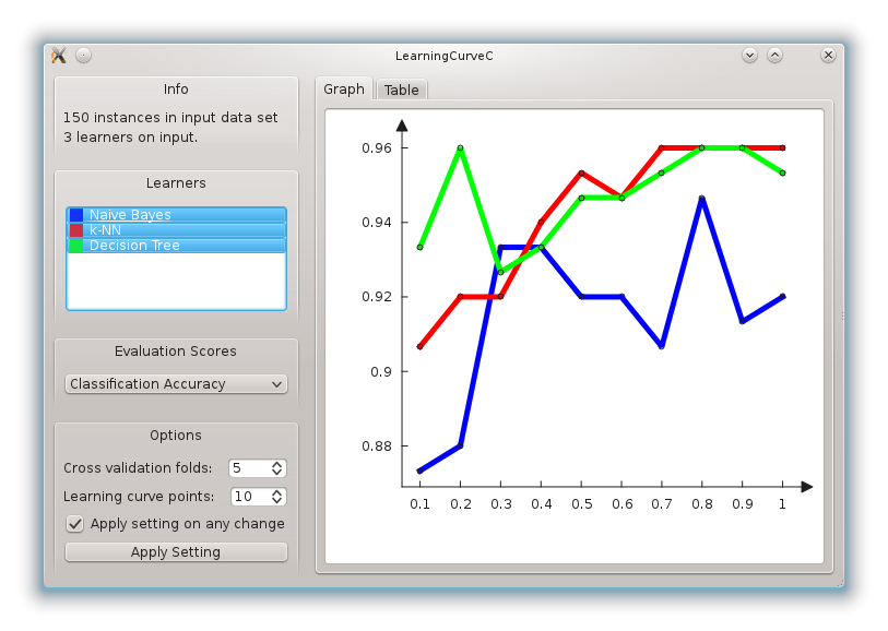
There are two new elements from our previous incarnation of a learning curve widget: a control with a list of classifiers, and a graph with a plot of learning curves. From a list of classifiers we can select those to be displayed in the plot.
The widget still provides learning curve table, but this is now offered in a tabbed pane together with a graph. The code for definition of the tabbed pane, and initialization of the graph is:
# start of content (right) area
tabs = OWGUI.tabWidget(self.mainArea)

# graph widget
tab = OWGUI.createTabPage(tabs, "Graph")
self.graph = OWPlot(tab)
self.graph.setAxisAutoScale(QwtPlot.xBottom)
self.graph.setAxisAutoScale(QwtPlot.yLeft)
tab.layout().addWidget(self.graph)
self.setGraphGrid()
OWPlot is a convenience subclass of QGraphicsView and is imported from plot.owplot module. For the graph, we use set_axis_autoscale to request that the axis are automatically set in regard to the data that is plotted in the graph. We plot the graph in using the following code:
def drawLearningCurve(self, learner):
    if not self.data: return
    curve = self.graph.add_curve(learner.name, xData=self.curvePoints, yData=learner.score, autoScale=True)

    learner.curve = curve
    self.setGraphStyle(learner)
    self.graph.replot()
This is simple. We store the curve returned from add_curve with a learner, and use a trick allowed in Orange that we can simply store this as a new attribute to the learning object. In this way, each learner also stores the current scores, which is a list of numbers to be plotted in the graph. The details on how the plot is set are dealt with in setGraphStyle function:
def setGraphStyle(self, learner):
    curve = learner.curve
    if self.graphDrawLines:
        curve.set_style(OWCurve.LinesPoints)
    else:
        curve.set_style(OWCurve.Points)
    curve.set_symbol(OWPoint.Ellipse)
    curve.set_point_size(self.graphPointSize)
    curve.set_color(self.graph.color(OWPalette.Data))
    curve.set_pen(QPen(learner.color, 5))
Notice that the color of the plot line that is specific to the learner is stored in its attribute color (learner.color). Who sets it and how? This we discuss in the following subsection.
Colors in Orange Widgets
Uniform assignment of colors across different widget is an important issue. When we plot the same data in different widgets, we expect that the color we used in a consistent way; for instance data instances of one class should be plotted in scatter plot and parallel axis plot using the same color. Developers are thus advised to use ColorPaletteHSV, which is provided as a method within OWWidget class. ColorPaletteHSV takes an integer as an attribute, and returns a list of corresponding number of colors. In our learning curve widget, we use it within a function that sets the list box with learners:
def updatellb(self):
    self.blockSelectionChanges = 1
    self.llb.clear()
    colors = ColorPaletteHSV(len(self.learners))
    for (i,lt) in enumerate(self.learners):
        l = lt[1]
        item = QListWidgetItem(ColorPixmap(colors[i]), l.name)
        self.llb.addItem(item)
        item.setSelected(l.isSelected)
        l.color = colors[i]
    self.blockSelectionChanges = 0
The code above sets the items of the list box, where each item includes a learner and a small box in learner’s color, which is in this widget also used as a sort of a legend for the graph. This box is returned by ColorPixmap function defined in OWColorPalette.py. Else, the classifier’s list box control is defined in the initialization of the widget using:
self.cbox = OWGUI.widgetBox(self.controlArea, "Learners")
self.llb = OWGUI.listBox(self.cbox, self, "selectedLearners", selectionMode=QListWidget.MultiSelection, callback=self.learnerSelectionChanged)

self.llb.setMinimumHeight(50)
self.blockSelectionChanges = 0
Now, what is this blockSelectionChanges? Any time user makes a selection change in list box of classifiers, we want to invoke the procedure called learnerSelectionChanged. But we want to perform actions there when changes in the list box are invoked from clicking by a user, and not by changing list box items from a program. This is why, every time we want learnerSelectionChanged not to perform its function, we set self.blockSelectionChanges to 1.
In our widget, learnerSelectionChanged figures out if any curve should be removed from the graph (the user has just deselected the corresponding item in the list box) or added to the graph (the user just selected a learner):
def learnerSelectionChanged(self):
    if self.blockSelectionChanges: return
    for (i,lt) in enumerate(self.learners):
        l = lt[1]
        if l.isSelected != (i in self.selectedLearners):
            if l.isSelected: # learner was deselected
                l.curve.detach()
            else: # learner was selected
                self.drawLearningCurve(l)
            self.graph.replot()
        l.isSelected = i in self.selectedLearners
The complete code of this widget is available here. This is almost like a typical widget that is include in a standard Orange distribution, with a typical size just under 300 lines. Just some final cosmetics is needed to make this widget a standard one, including setting some graph properties (like line and point sizes, grid line control, etc.) and saving the graph to an output file.
Further reading
This tutorial only shows one kind of a plot. If you wish to use different and more complicated plots, refer to the Plot module documentation.